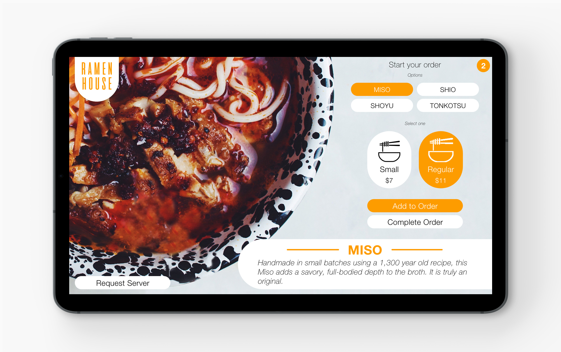
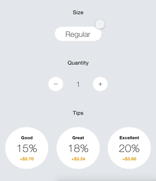
JEREMY JAHJA
Web Icon for Home Page
Ramen House
A fictional restaurant specializing in four traditional types of ramen.
OVERVIEW
I wanted to create a digitally interactive way for customers to order their meal. In this project I explore composition, color combinations, interaction, typography, and the user experience as a whole.

The goal was to create a simple, easy-to-use interface for customers to order food in a ramen restaurant.

Inspiration
I went to a ramen and dumpling restaurant in Portland called AFURI for the first time on a Saturday night. It was amazing. The entire place felt warm just like home and needless to say the food was exceptional. What particularly struck me the most was the way I ordered my food. I was given the option to either order from a person or a machine (kiosk). I chose the latter. I have a huge interest in the way humans interact with technology to "better" our way of living. So far the only restaurants that come to mind that include ordering via kiosk are: McDonalds, Applebees, and Red Robin. AFURI surprised me with how simple and functional their interface was.
Brainstorm
In order to get started with this project I had to come up with a list called "How Might We." It's a list that derives from my personal goals and needs as a customer. These things are all important and serve as a guide for my design.

This list was curated based on my personal experience as a customer. Take this as a UX brainstorm/word cloud.
Research + User Flow
An article posted on Upserve, Restaurant Insider, reads: "At the 2018 National Restaurant Association the number of self-checkout kiosks being showcased almost tripled from just one year earlier. With 79% of customers saying that they believe restaurant kiosks make their experience more convenient, according to NRA data, expect it to be a growing trend."With this information, we can only assume the number of kiosks is going to increase to better the service of the customer. This flowchart is a basic example of how ordering at a restaurant would, and should, work in the customer's point of view.
Ideas
I imagine the orientation of this UI to be in landscape view. Shown below is a rough sketch of several screens with some notes on any changes or additions. The Pinterest mood board shows the type of look and feel I am going for. I imagine the interface to be simple and understandable with as few buttons as possible.
Prototypes
The final design is a simple interface with beautiful imagery. The UI itself appears very warm and inviting. It covers everything a user needs to complete an order. The interactions are easy to understand and follow.
Ramen image
Ordering Interaction
When an option is selected the button turns, and/or stays, orange.

The summary page can be navigated to by tapping:
(1) The Cart represented by the circle icon on the top right; or
(2) Complete Order button below.
Summary Interaction
Users can easily edit their order size, quantity, and select their tip of choice.
Lessons
One major lesson I learned when it comes to the user experience is that micro-interactions make a big difference to ensure confidence to the user. As the UX designer, I want to make sure I leave as little room for questions as possible for the end user. Overall this was a fun project for me to understand my own thought process for how I would go about designing an interface for a restaurant.
back to top